

Case Study
Redrawing the brand's route
Smart Mobility SaaS · B2B
Founded in 2017, Madrid
Startup
Problem
When the message gets lost along the way
Celering had built a robust solution to optimize corporate mobility for businesses. However, their brand wasn't helping to convey that same level of reliability.
As the company grew, so did its communication needs. A lack of clear visual guidelines had led to an inconsistent identity across channels, where the use of color, typography, graphic elements, and layouts lacked a unified logic.
This made it difficult for the brand to project the image of a corporate mobility leader it aspired to be, causing the message to lose impact at every market touchpoint.
Diagnóstico
Time to define a new visual route
Analysis showed that the problem wasn't with Celering's identity, but with the lack of a visual structure capable of supporting it.
The brand had recognizable elements and a solid value proposition, but the use of colors, icons, illustrations, typography, and layouts didn't follow common criteria. This created inconsistencies across channels and made it difficult for their communication to convey the technical, innovative, and professional nature of the solution.
It was necessary to stop thinking in terms of isolated pieces and instead build a coherent visual system capable of organizing communication, facilitating message clarity, and supporting the brand's growth.
Solution
A brand ready to keep moving forward
To restore coherence to their communication, the brand's visual rules were redefined without altering its essence.
Building on existing elements, a visual system was created to meet the needs of all communication channels. The color palette was expanded, clear criteria for color usage were established, the role of icons and illustrations was reorganized, and typographic standards were defined to ensure brand consistency as it scales.
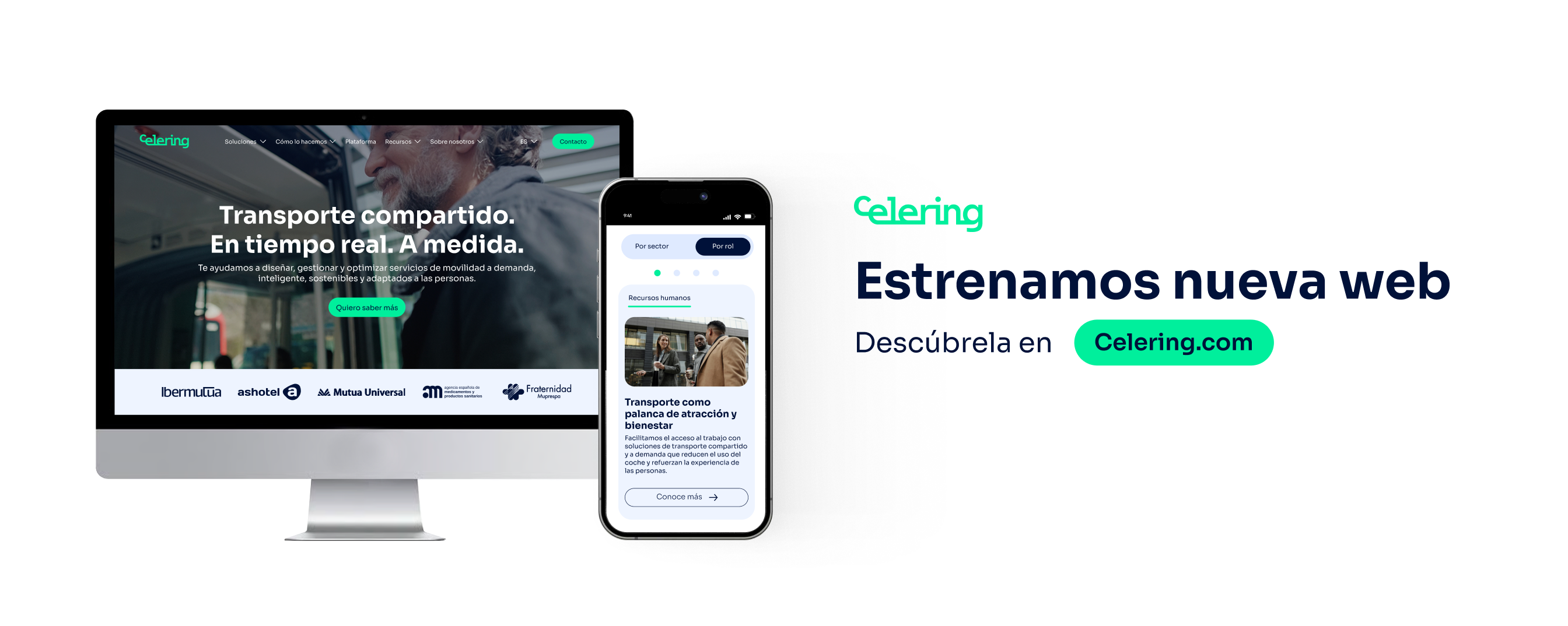
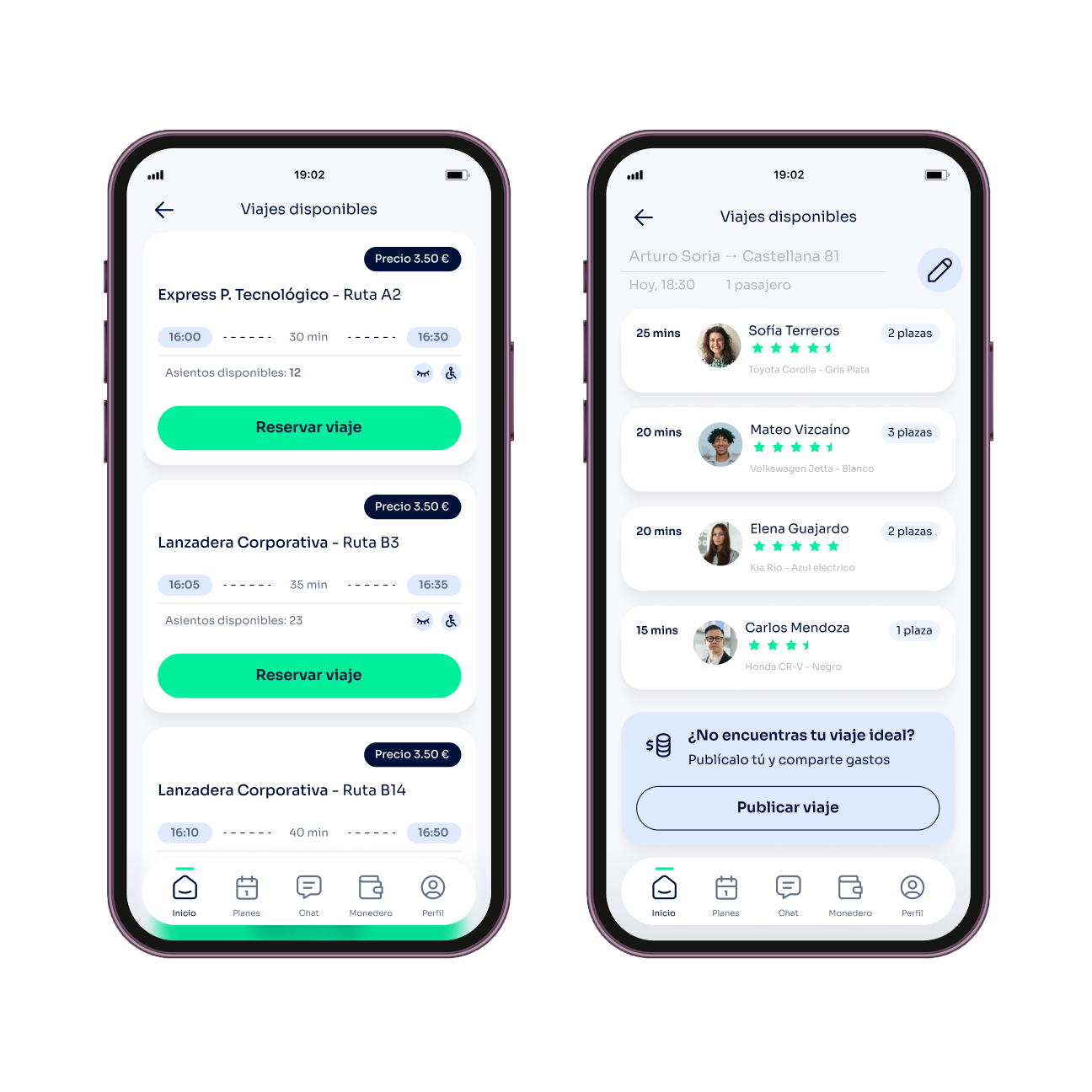
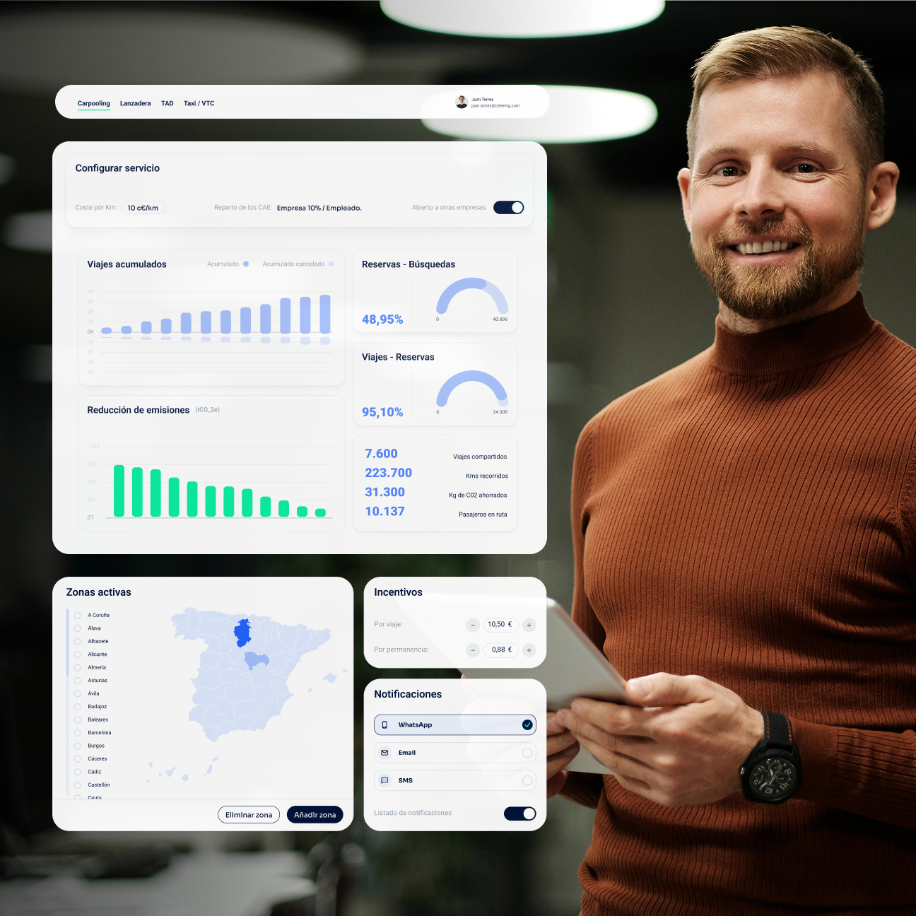
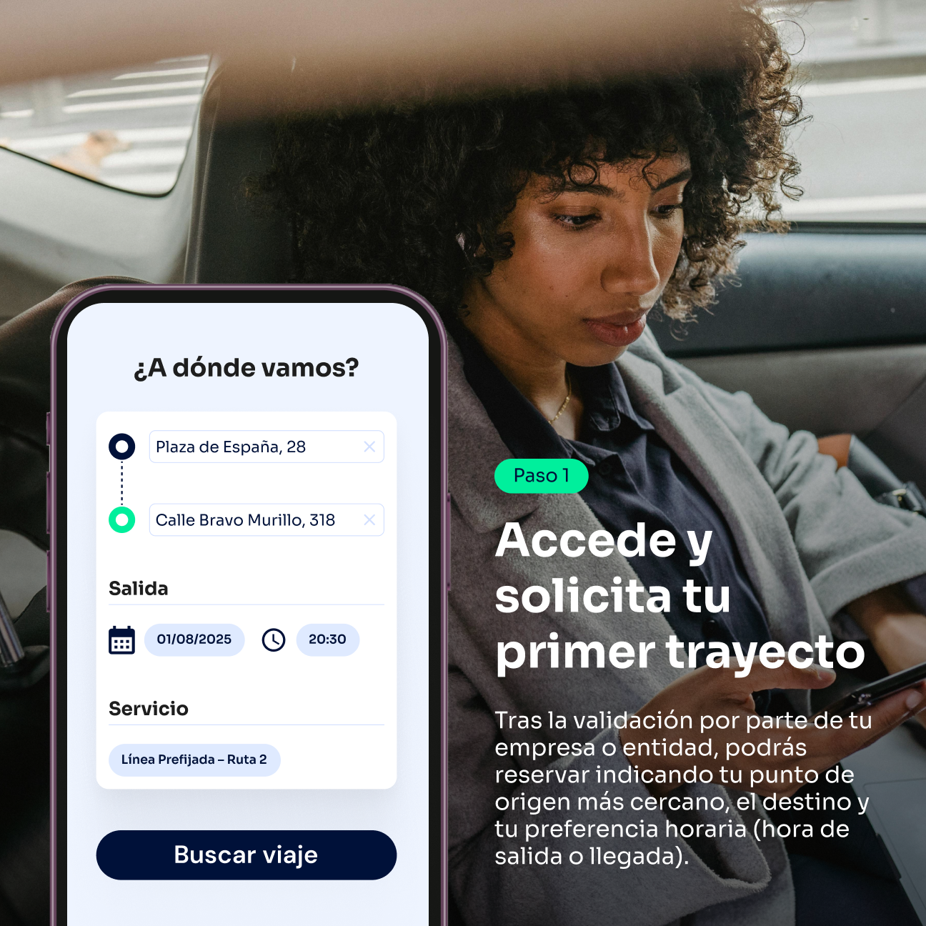
Furthermore, the visual language evolved toward clearer, more balanced, and professional communication, incorporating more natural photographic styles, realistic mockups, and a product presentation aligned with industry standards in the mobility sector.
The result was a more coherent, scalable brand, ready to clearly communicate the value of the solution at every market touchpoint.
Results
Results achieved with Extandard
Other Case Studies
See all







Join our newsletter
